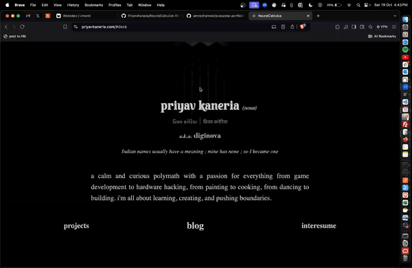
Insides and outsides of my website
Context
This is a writeup, mainly for my own documentation as to what thoughts went in while I made my new personal website. I bought the domain a few months ago and had this planned from years since I made my first portfolio in my college first year. The complete process took be near about 3 months more or less.
Collecting inspirations
I spent a week just collecting good personal websites. Came across amazing people and their personal brands. I already had some points in mind:
- it has to be minimalist
- I have been into web development for about 10yrs now and have seen all kinds of websites. even the most craziest possibilites of web tech. But to keep my personal brand, it has to be minimum information. I don’t have much time, neither does the person who wants to know about me.
- it has to look cool
- Even after being minimalist, it has to be unique. something you might want to show to someone else to look at. something that makes you gasp/smile.
- need to convey my skills through the fine tuned details
- call to action for my blog
- If someone really wants to know about me, they should know about my thoughts straight up. My skills and all will be proven thereafter.
- Let the users decide on whether he wants to see my projects, my thoughts or probably everything about me in single pdf
After looking at about atleast a 100 or more websites I collected these notes -
Expand notes
- https://www.alexwest.co/
- time travel allows you to see how his main about section (or whole) website changed over the years pretentious mode changes content to linkedin like slop with numbers and shit ⁃ most prefer white mode for personal page as it focuses better on content (personal experience)
- https://www.binwang.me/about.html
- blog index like outline and direct about
- https://clarissawei.com/
- simple straight up sidebar and content
- https://otoro.net/ml/
- a running example of neural network agents running, which is interactive on cliking arrows keys control right one and wasd for the left one, which after timeout auto switches to neural netowrk
- also on the main domain there is nothing but an interative game where on mouse click prey is spawned and some predators run to eat it
- https://jasonbenn.com/
- simple website with good banner
- i like the color scheme, it’s like notion
- https://jk-lee.com/
- attention grabbing big fonts in hero section
- a vitae page is good
- can be fetched from linkedin with a webhook or manually
- https://jvns.ca/
- nice navbar design
- https://paul.copplest.one/knowledge/
- a knowledge section which has thoughts on any random topic is good. it’s good for documentation but not really something people want to see i think
- https://www.vivekpanyam.com/
- simple beautiful and to the point. good font selection
- https://vibertthio.com/
- simple but elegant interactive background with mesmerising geometric shape
References -
- https://github.com/emmabostian/developer-portfolios
- https://github.com/amnashanwar/awesome-portfolios
- personal exploration
Isometric game of life
While curating these, I got some interesting ideas of experimenting with conway’s game of life. Specifically of simulation in different sided polygon planes. Started cooking something with 3D game of life, quatum rules, rhombic grid, isometric grid etc. Was already curious about wasm and it’s usage and decided to learn and port to wasm. wasm is so damn awesome.
Side story on the side, the isometric grid took my most attention. While simulating different variations of birth rules in isometric grid I felt that this kind of geometric animation is what I’m looking for. I started experimenting on the side with individual grid cell animations, 3d transformations and the most efficient way I can utilize wasm here to make it working.
This is what I ended up with
 Dock theme animation
Let’s get into some technical details of the dock
The rust code implements the Grid class for maintaining state and methods for changing state of individual cells, A TransformMatrix class for the rotations calculations, and a triangle_height function just for quick calculation of trignometric heights.
The triangles are tricky to imagine as a grid so here is a diagram to help understand
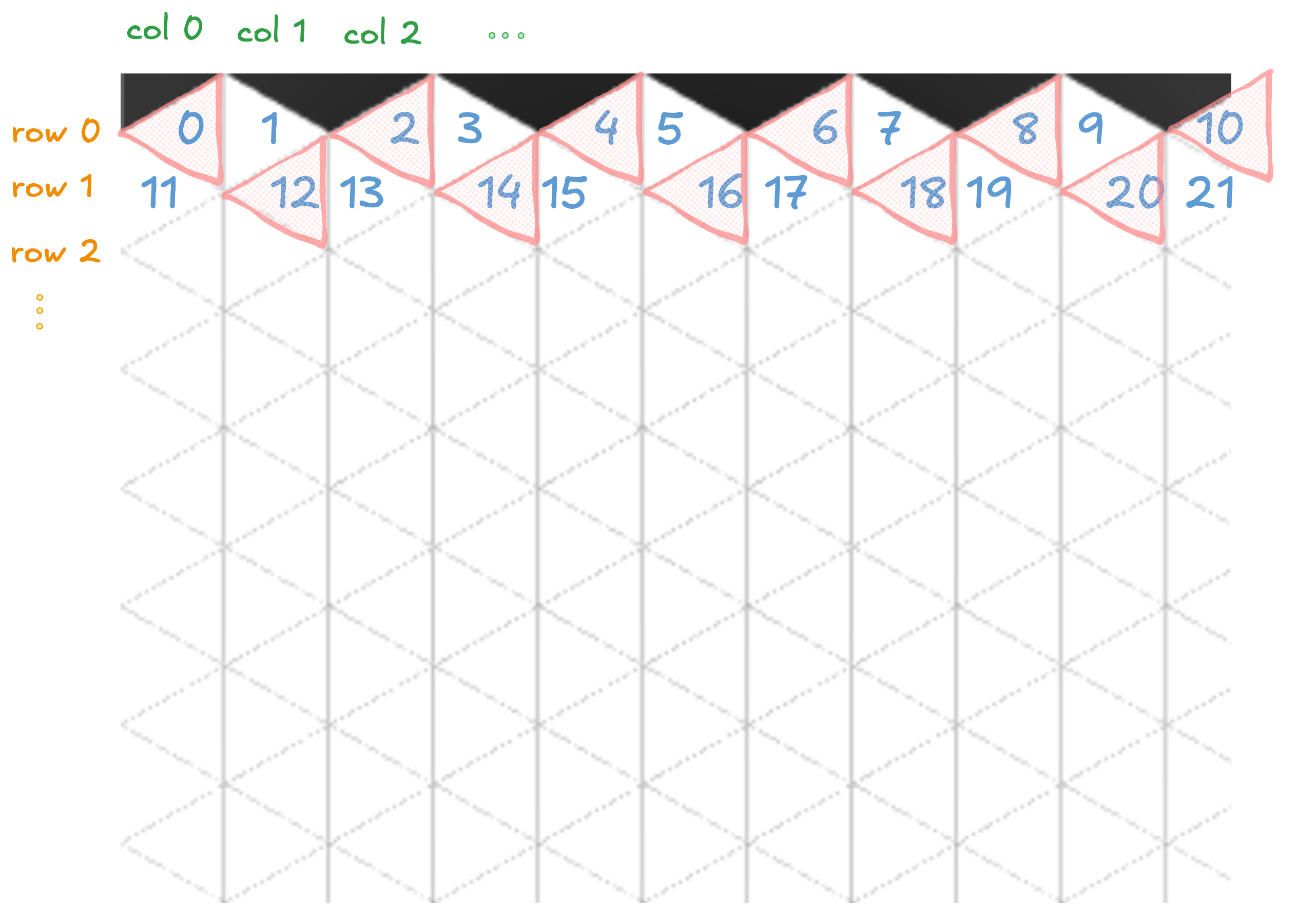 Isometric grid as 2D array
Notice, the cells of the grid with even count number (marked in red) are all facing one direction, and remaining are facing the other? this count number can be identified simply as when (row + col) is even, the count is guaranteed to be even (simple maths. no? try it out).
To draw the triangles, we use the HTML5 Canvas API. The drawTriangle function is responsible for rendering each triangle:
1
2
3
4
5
6
7
8
9
10
11
12
13
14
15
16
17
18
19
20
function drawTriangle(row, col, x, y, flip_state) {
    ctx.save();
    // ... (transformation code omitted for brevity)
    ctx.beginPath();
    ctx.moveTo(x, y);
    if ((row + col) % 2 == 0) {
        const extraOffset = 0.3;
        ctx.lineTo(x + tileTriangleHeight - extraOffset, y + TILE_SIZE / 2);
        ctx.lineTo(x + tileTriangleHeight - extraOffset, y - TILE_SIZE / 2);
    } else {
        ctx.lineTo(x, y + TILE_SIZE / 2);
        ctx.lineTo(x + tileTriangleHeight, y);
        ctx.lineTo(x, y - TILE_SIZE / 2);
    }
    ctx.closePath();
    // ... (coloring code omitted for brevity)
    ctx.fill();
    ctx.stroke();
    ctx.restore();
}
This function uses the (row + col) % 2 == 0 check we discussed earlier to determine the orientation of each triangle. We use ctx.lineTo() to draw the triangle’s edges, ensuring that adjacent triangles fit together perfectly.
Now, let’s dive into the animation of the flip and color change. The color change is handled by manipulating the HSL color space:
1
ctx.fillStyle = `hsl(0, 0%, ${((MAX_FLIP_STATES + flip_state) / (2 * MAX_FLIP_STATES)) * 100}%)`;
This clever bit of code maps our flip_state (which ranges from -MAX_FLIP_STATES to MAX_FLIP_STATES) to a grayscale value between 0% (black) and 100% (white). As the flip_state changes, the color smoothly transitions between these extremes.
For the flip animation, we’re using matrix transformations. This is where WebAssembly (WASM) comes into play. The TransformMatrix class, implemented in Rust, handles the complex calculations required for the rotation effect:
1
2
3
4
5
6
const transform = TransformMatrix.new();
const result = transform.apply_transformations(clickedTileX, clickedTileY, x + TILE_SIZE / 2, y, flip_state / MAX_FLIP_STATES);
const transformMatrix = new DOMMatrix([
    result.a, result.b, result.c, result.d, result.e, result.f
]);
ctx.setTransform(transformMatrix);
By offloading these calculations to WASM, we achieve smoother animations and better performance, especially on devices with limited processing power. This is crucial for maintaining a fluid user experience across various devices.
Overlay and iframes
The magic behind the seamless transitions in this portfolio lies in a clever combination of overlays and iframes.
The injectOverlay function dynamically injects two iframes into the page:
- An overlay iframe (
#overlay-iframe) that hosts the main content and the dock. - A projects iframe (
#projects-iframe) for smooth transitions to the projects page.
1
2
3
4
5
6
7
8
9
10
11
12
13
14
function injectOverlay(projectOnly = false) {
    // ... (style injection code omitted for brevity)
    const iframe = document.createElement("iframe");
    iframe.id = "overlay-iframe";
    // ... (iframe setup code omitted)
    document.body.insertBefore(iframe, document.body.firstChild);
    iframe.src = dockURL;

    const projectsIframe = document.createElement("iframe");
    projectsIframe.id = "projects-iframe";
    // ... (projects iframe setup code omitted)
    document.body.insertBefore(projectsIframe, document.body.firstChild);
    projectsIframe.src = "https://projects.priyavkaneria.com/";
}
This approach allows for independent scrolling within each section while maintaining that background animation. It’s like having multiple pages in one, without the jarring page reloads!
Handling the dock
The dock isn’t just a pretty face – it’s the navigation powerhouse of this portfolio. Events fired when you click on a link:
- The background animation flips those triangles (remember our
grid.set_flipping(index)from earlier?). - The revealer gradient updates to match the new theme.
- The appropriate iframe content loads up.
This intricate dance is orchestrated through event listeners and some crazy postMessage communication between the main page and the iframes:
1
2
3
4
5
6
7
8
9
10
window.addEventListener("message", (e) => {
    if (e.origin === dockURL) {
        if (e.data[0] === "theme") {
            // ... (theme handling code omitted)
        } else if (e.data[0] === "href") {
            // ... (navigation handling code omitted)
        }
        // ... (other message handling code omitted)
    }
});
Handling the navigation
Navigation in this portfolio is where traditional meets innovative. The dock provides quick access to main sections, but the real magic happens behind the scenes.
The checkUrlAndManageIframe function is the traffic controller here:
1
2
3
4
5
6
7
8
9
10
11
12
13
14
function checkUrlAndManageIframe() {
    const currentUrl = window.location.href;
    const iframeElement = document.getElementById("overlay-iframe");

    if (currentUrl.includes("#blog")) {
        iframeElement.style.display = "none";
        document.documentElement.style.overflow = "auto";
    } else if (currentUrl.includes("#projects")) {
        projectsIframe.style.display = "block";
    } else {
        iframeElement.style.display = "block";
        document.documentElement.style.overflow = "hidden";
    }
}
This function checks the current URL and manages the visibility of our iframes accordingly. It’s like a stage manager, ensuring the right “actors” are on stage at the right time.
We’ve also got a hashchange event listener that triggers this function whenever the URL hash changes, ensuring smooth transitions even as users navigate around:
1
window.addEventListener("hashchange", checkUrlAndManageIframe, false);
Keeping the user engaged
Engagement is the name of the game in any portfolio, and I wanted to make sure there are fine details sprinkled that give the “aha” momemnt to the user when they find it themselves. This includes the revealer on mouse move, the animation on click, the trailing particles on link hover etc.
1
2
3
4
5
6
7
8
function addTrailingParticles(loader) {
    // ... (particle creation code omitted for brevity)
    // the trailing particles are made using three circles that are following three fixed parabolic paths, two classic parabolas and one sum inverse of both
    function animate() {
        trackElement(loader);
    }
    setInterval(animate, 1000 / 10);
}
Building the hype
While this portfolio is something I wanted to build for myself, I was and am still learning to sell. This was one of things I tried, before launch to create some hype.
The subtle details for the dopamine hit
It’s the little things that often leave the biggest impression. I wanted my website to be chock-full of subtle details that provide those satisfying “aha” moments. This is something that I’ve always loved and you can observe that in full in my old portfolio fancy.priyavkaneria.com
Working on feedback
Received good feedback from people from lots of places. Some things I am working on
- navigation is still wrong
- there is no way of going back to dock from the blog page [fixed]
- projects page link also can be in the blog sidebar [fixed]
- interesume link is blocked/not working for random iterations, works on second time [can’t help, so moved]
I hope by going through this journey with me you learnt something new as well. Feel free to reach out for anything.